06
Sleeve Notes
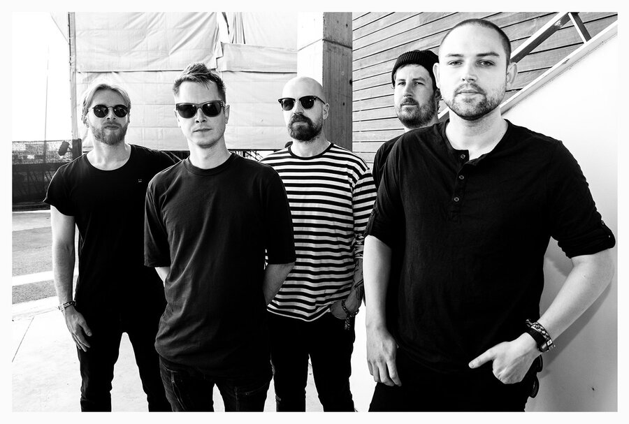
The Twilight Sad
Sleeve Notes
The Twilight Sad
James Graham, Sebastien Schultz, Jonathan Docherty, Andy MacFarlane and Brendan Smith.
In their own words, The Twilight Sad are a Scottish band who enjoy making miserable music. In reality, they are far more than that. They make big, bold and dark songs that are direct and unapologetically honest.
Their own sleeves (designed by DLT who also works with the likes of Mogwai, C Duncan, and Fujiya & Miyagi) are distinct. Like their songs, they tell a story, offering a glimpse into the world of the music.
Forward asked the band to have a think about their most influential or favourite sleeves. With five members, now spread over three cities, that's only two each.
Here are their selections.
1994
The Manic Street Preachers
The Holy Bible
Epic
'In my opinion an album's artwork should be challenging and have an insight into what you’re about to listen to'.
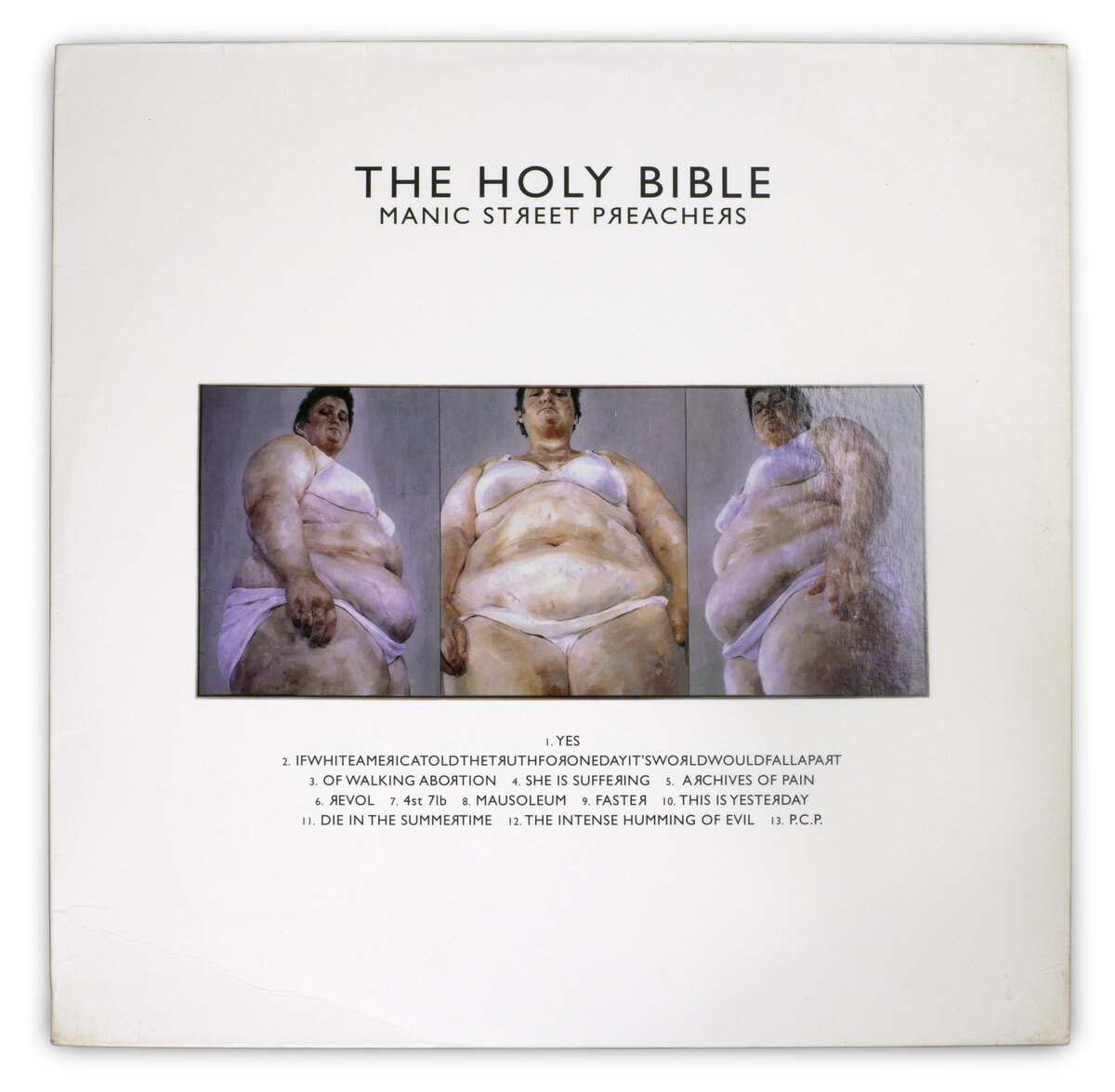
Like the music and the lyrical content, the artwork (featuring a triptych by painter Jenny Saville) for this record is shocking, important, dark and thought provoking. It’s one of my favourite albums of all time. In my opinion, an album's artwork should be challenging and have an insight into what you’re about to listen to.
James Graham
2017
Conflats
Out Lines
Rock Action
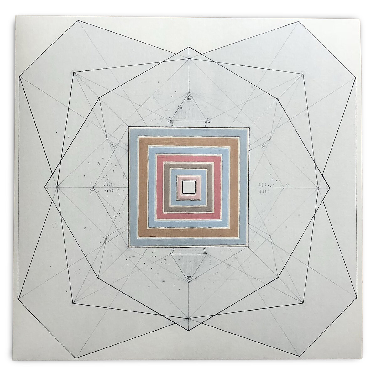
'I’m reminded of what an amazing talent he was, both as a songwriter and an artist'.
I suppose this is cheating as it’s an album I’m involved with, but the artwork for the record is incredibly important to me.
My friend Scott Hutchison designed the album cover and inner sleeve. It was the last collaboration that we had together. I have the original artwork framed in my living room, every day I look at it and I’m reminded of what an amazing talent he was, both as a songwriter and an artist. He totally got what we were trying to do with the album and I’m incredibly proud of his beautiful design.
James Graham
1997
Godspeed You! Black Emperor
F# A# ∞
Constellation Records
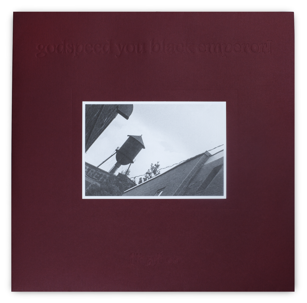
The compelling design of this record sleeve is not necessarily the outside (although the first 500 copies had an actual photograph hand-glued to the front cover), but what’s included on the inside that makes it so memorable.
The inner sleeve contains drawings and writings featuring post-apocalyptic, anti-government conspiracy inserts held within a Manila envelope – perfectly complementing the songs on the record. Upon finding the Canadian penny crushed by a train, you feel as though this could be the musical extension of The Anarchist Cookbook.
Sebastien Schultz
1999
Man or Astro-man?
EEVIAC Operational Index and Reference Guide, Including Other Modern Computational Devices
Touch and Go Records
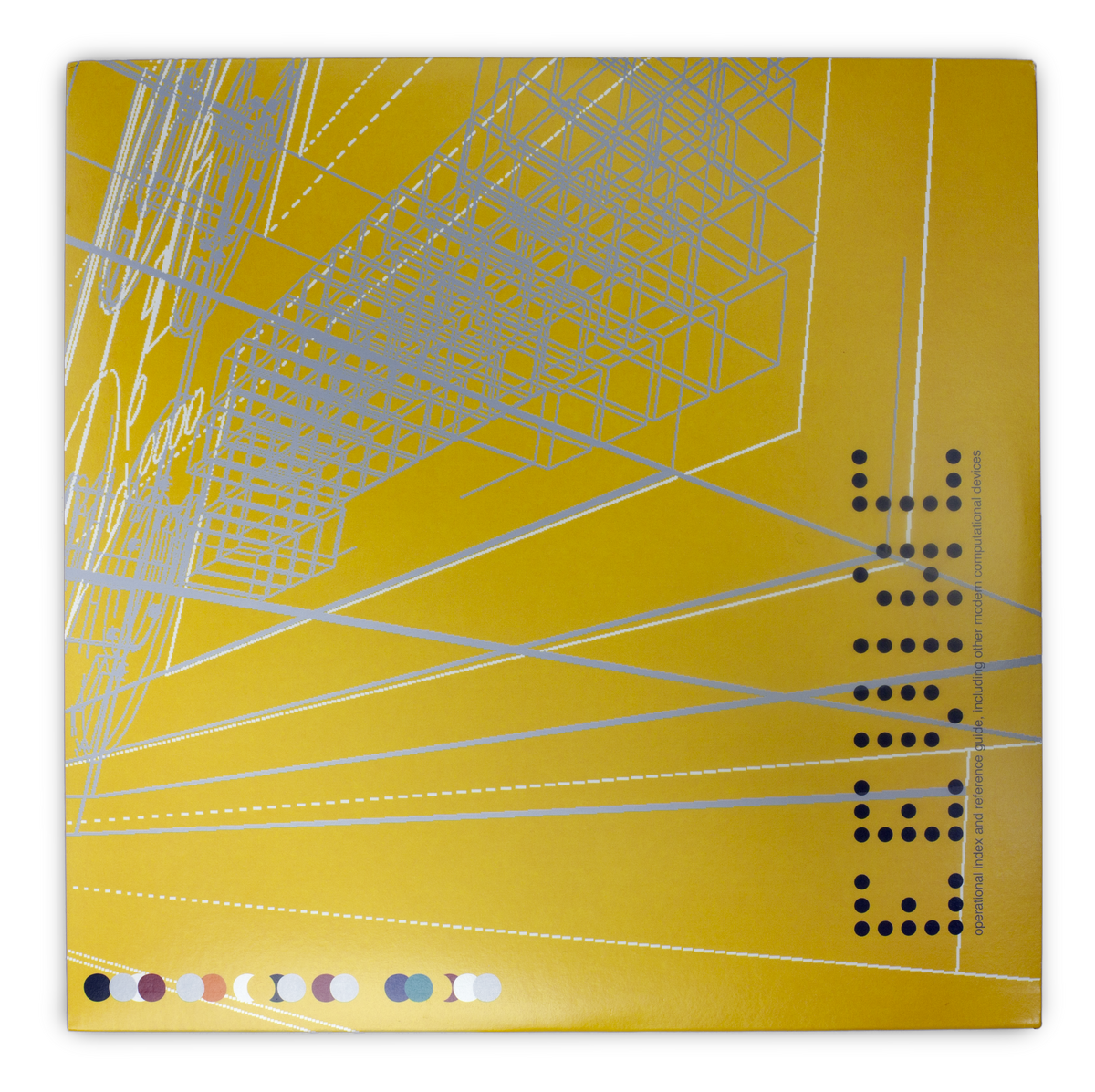
I had heard previous EPs from Man or Astro-man? – and their label, Touch & Go Records, was certainly a staple of 90s indie in the US. That said, this album’s packaging ultimately convinced me to pick it up.
With the album’s peculiar name (paying homage to the first electronic computer) and an aesthetic that blends science fiction with surf rock, the sleeve design feels both analog + digital. The original pressings also included a sleeve with die-cut hole punches – mimicking the original punched cards used by IBM and others in the early stages of modern computing.
Sebastien Schultz
1992
Darkthrone
A Blaze In The Northern Sky
Peaceville Records
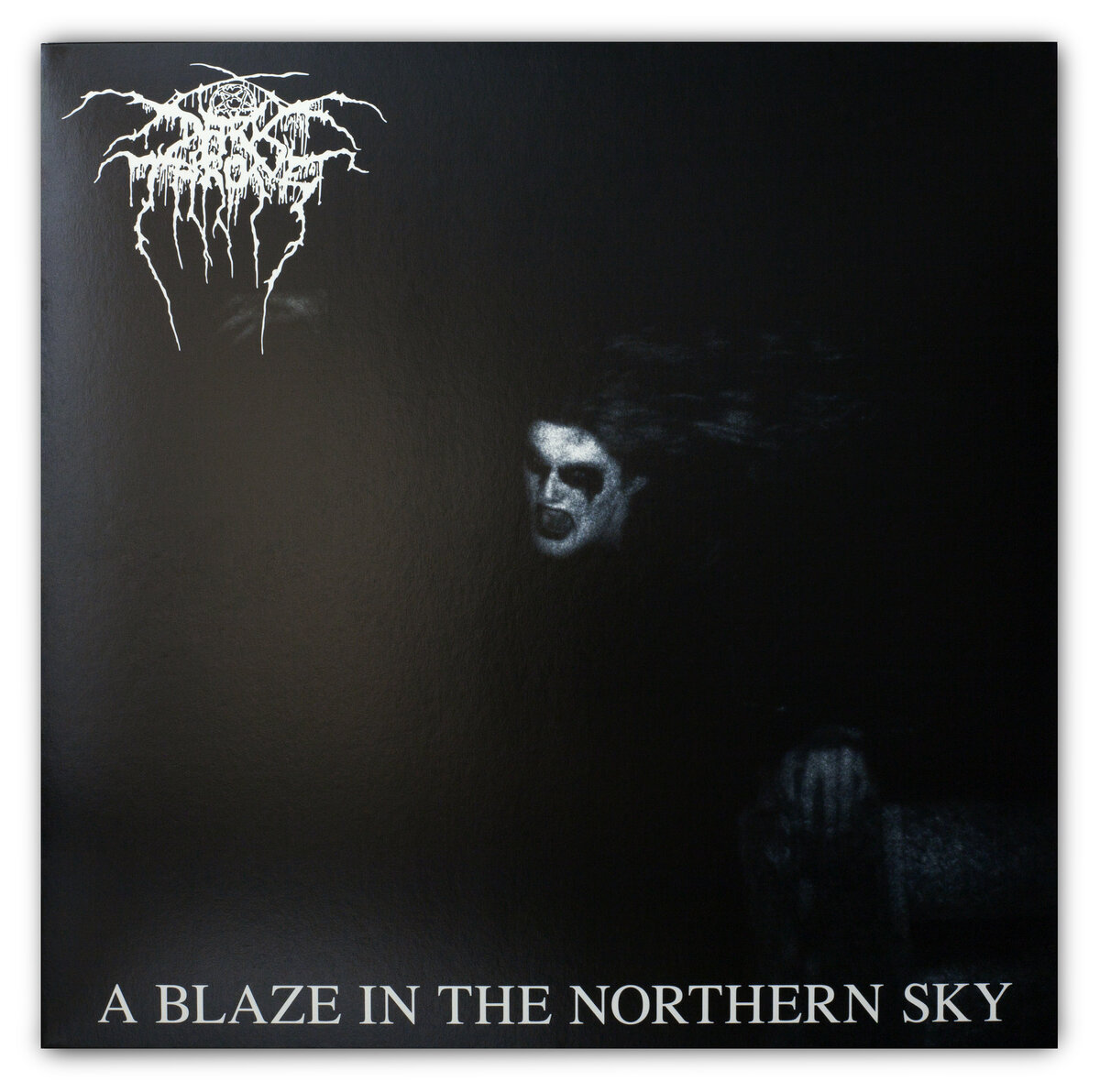
Cold, dark and bleak, just like the music. This album cover concept was the first of its kind when it came out in 1992. The majority of heavy metal album covers dating back to the early eighties were mainly paintings of demonic style monsters, be they skeletons or devils or some other kind of grotesque imagery. This was a breakthrough cover at the time and truly original.
Jonathan Docherty
1998
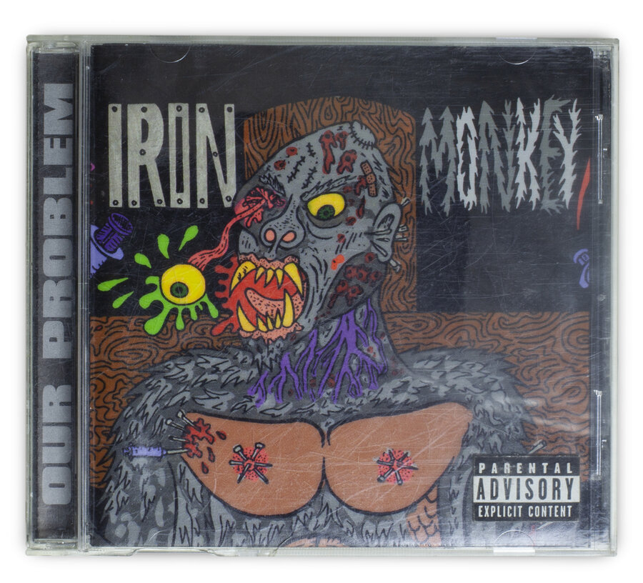
Iron Monkey
Our Problem
Earache
'The cover doesn't really present itself until you open it out. I don't want to give away any spoilers. It's a sight to behold'.
One of the most disturbing record sleeves I have ever seen! Mike Diana is an underground cartoonist from the USA and the first illustrator to receive a criminal conviction for artistic obscenity and is the artist behind Iron Monkey's Our Problem.
The cover doesn't really present itself until you open it out. I don't want to give away any spoilers. It's a sight to behold.
Jonathan Doherty
1977
Wire
Pink Flag
Harvest
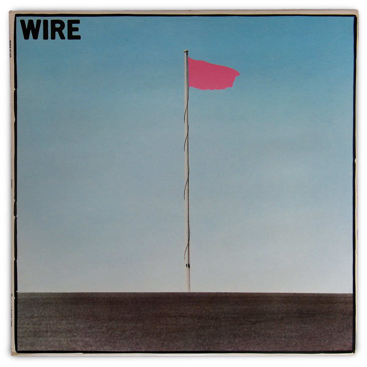
The imagery and layout of the first three Wire albums, and their singles, have been a big influence on the direction of our artwork. I like the amount of space on this cover, and the contrast of the flat-pink, painted flag on the black and white photograph, it really stands out in record shops.
Andy MacFarlane
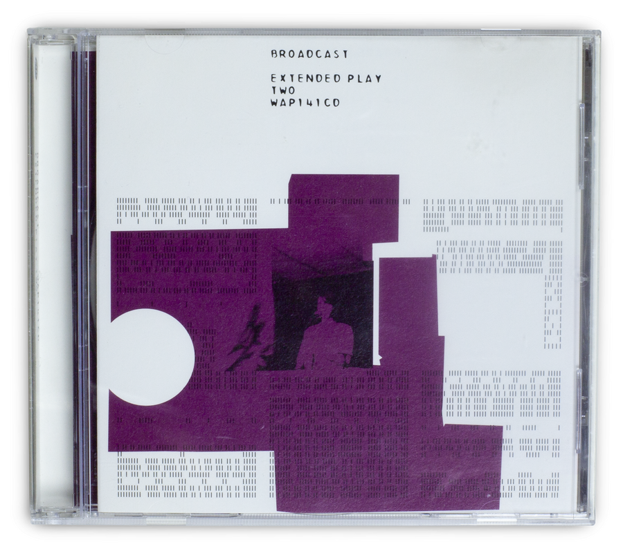
2000
Broadcast
Extended Play Two
Warp Records
This sleeve (Designed by Julian House) was a reference point for our last album. The random, glitchy layout and the blocks of colour were something I thought worked well with what we were doing.
Andy McFarlane
1995
Scott Walker
Tilt
Fontana
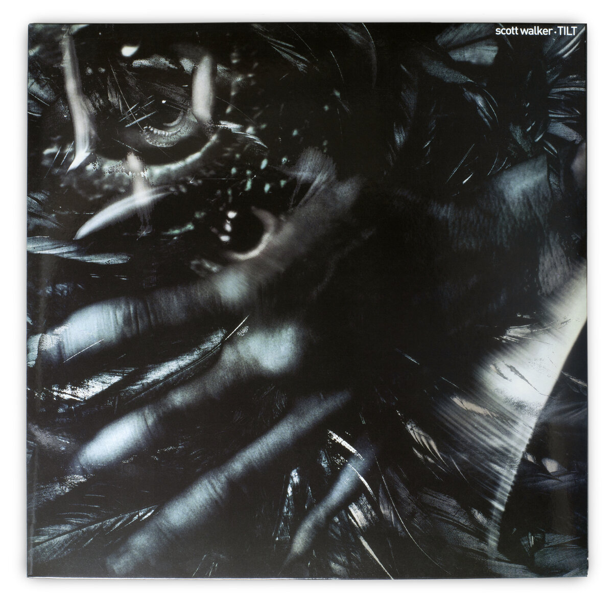
A mysterious, ageing man barely visible through his distorted hand. This image sums up everything you could ever hope to know about Scott Walker.
Working with an original concept from Walker, photographer David Scheinman and the graphic design studio Stylorogue, collaborated perfectly to help produce his first release in 11 years. I really like that it could be a bleak painting or a photograph at the same time, and that the lyrics are stacked in rigid columns within the inner sleeve.
Brendan Smith
1990
Cocteau Twins
Heaven or Las Vegas
4AD
'I love the thought of them messing around with different materials and lighting, waiting to see what developed, probably with little or no idea that they were about to contribute to one of Scotland’s most iconic albums'.
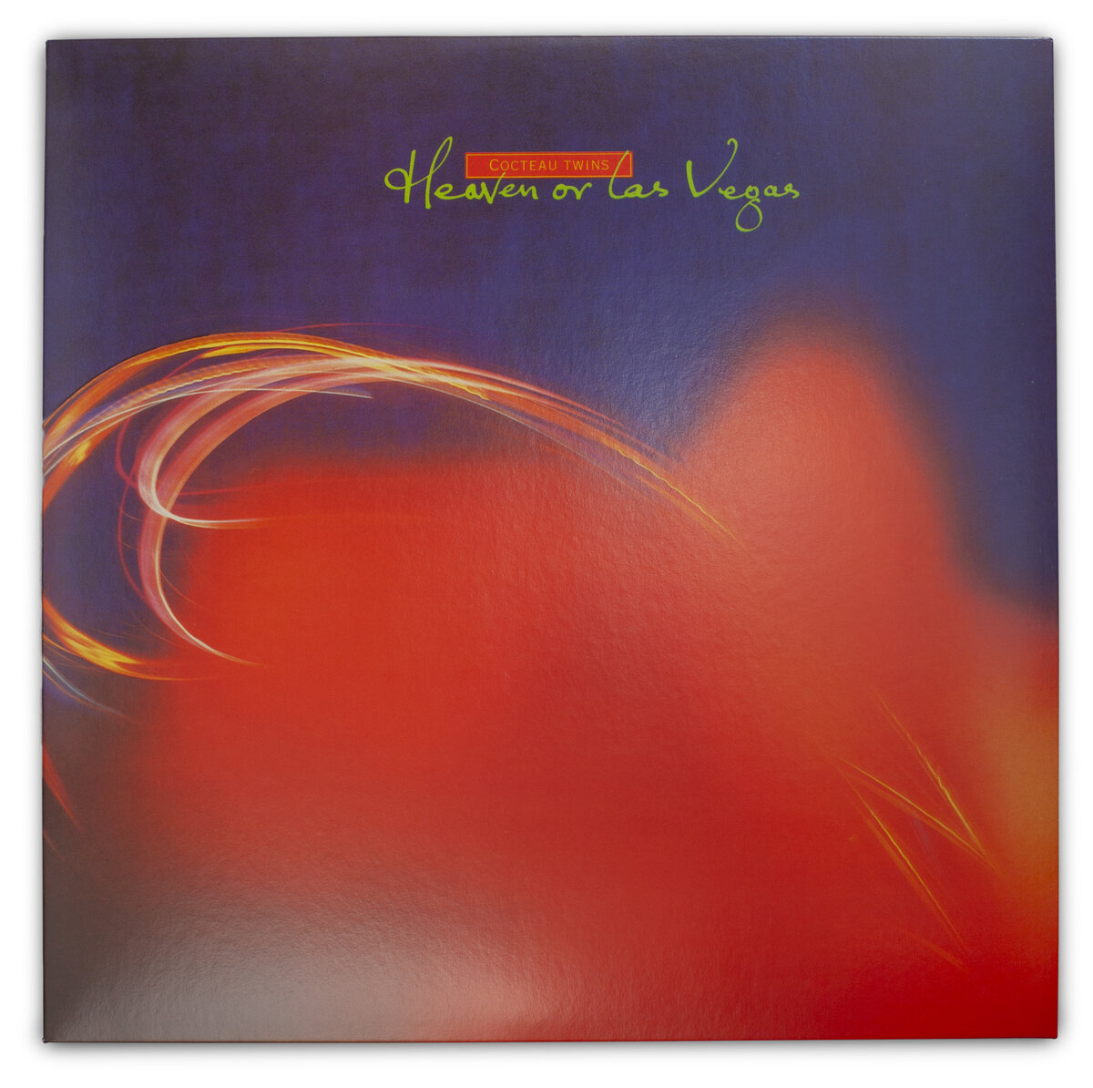
When the designer Paul West was a student, he wrote a thesis on the marriage of album cover art and the music it accompanied. Perhaps more than anything before or since, I think the imagery really evokes the sound of this record.
Robin Guthrie said he wanted to “capture the ethereal”, so West worked with photographer friend Andy Rumball, experimenting in a makeshift kitchen studio, taking 35mm stills of Christmas lights against coloured backgrounds.
I love the thought of them messing around with different materials and lighting, waiting to see what developed, probably with little or no idea that they were about to contribute to one of Scotland’s most iconic albums.
Brendan Smith
- 10. Simon Murphy
- Kate Trouw. Pettycur
- Heavenly Bodies. Hanon x Forward
- Take a Picture and Move On
- Like Tears in the Rain
- Sleeve Notes. The Twilight Sad
- Soul Food Sisters
- Poppy Nash
